Appearance
UDINA Design System
UDINA apps are build on top of SAPUI5 which implements the SAP Fiori Design System following the SAP Fiori Design Guidelines.
There may be scenarios, where it is better to switch to a different Web App Development Framework, but we would loose the Design System and the Enterprise Features, which are an integral part of SAPUI5.
The SAP Fiori Design System is still evolving and the latest evolution is the new Horizon theme. UDINA still depends on the former SAP Fiori 3 iteration of SAP Fiori, but will be migrated in the future, if all relevant features and dependencies are available.
The design system also takes care of new Design Trends that enrich the SAP Fiori Design System.
Single-page Application (SPA)
Using SPA utilize an innovative design approach that uses JavaScript’s ability to manipulate DOM elements on the page. The user doesn’t have to switch from one page to another or reload new pages. SPA enables them to continue interacting with the page, while new elements are fetched and updated.
What about Search Engine Optimization (SEO)?
One-page websites are responsive and provide better mobile UX, but they’re not SEO-friendly.
UDINA Solutions currently target Business-to-Employee (B2E) and Business-to-Business (B2B) relationships, so this does not matter.
For a Business-to-Consumer (B2C) scope, you have to validate the solution requirements!
Extending Apps
The SAPUI5 Extending Apps concept perfectly enriches a SPA by separating complex apps into multiple components, which can be lazy loaded on-demand. Even the app specific routing will be merged into the calling application.
Besides monoloythic apps, the design system also allows to offer a Service Portal for customers and employess, that dynamically loads additional functionaly on-the-fly. If there is a requirement to integrate multiple UX technologies, then maybe a microfrontend like Luigi is the right tool for the job.
This is somewhat similar to the SAP Launchpad Service, but following the UDINA Design System and allowing to enhance and implement customer requirements.
Layout
UDINA Commerce is designed as a Long-Scrolling, one-page website allowing storytelling and dynamically loaded content while scrolling into viewport (ex. search result images).

SAPUI5 instead uses a Full-Page-Layout website with a fixed height header and footer where the central area should occupy the remaining height.
The App Skeleton consist of the following areas:
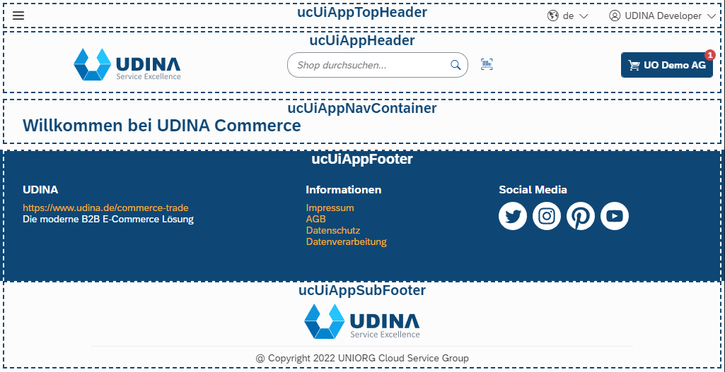
The SAPUI5 router will place all views inside the ucUiAppNavContainer and therefore share the same layout skeleton. This leads to a consistent Long-Scrolling website layout.
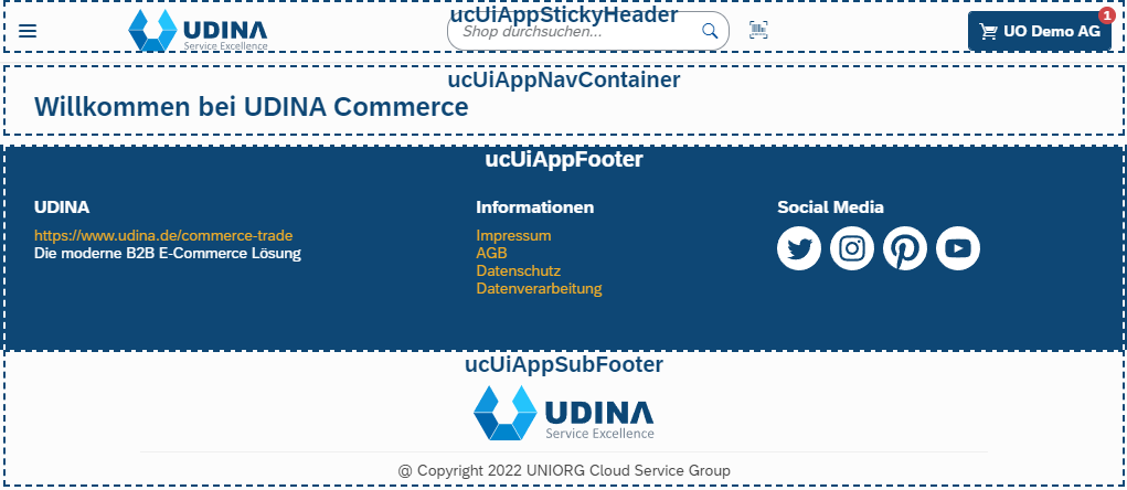
Sticky Header Navigation
For our Storefront, which is quite actionable, we implemented a Sticky Menu Navigation while scrolling down long webpages.
The ucUiAppHeader will be replaced by the ucUiAppStickyHeader that floats on top of the page content. This means that all actions and app navigations can be accessed at any time.
Scroll-to-Top Button
 To enhance the overall user experience, a Scroll-to-Top Button is added at the end of the page while scrolling long websites.
Floorplans
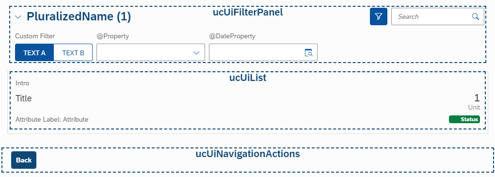
List Report
With a list report, users can view and work with a large set of items. This floorplan offers powerful features for finding and acting on relevant items. It is often used as an entry point for navigating to the item details, which are usually shown on an object page.
| Component | Description |
|---|---|
| Filter Panel | The filter panel (default collapsed) contains the list report header title (pluralized form of entity type) with the amount of items (count). The right side contains additional actions, like expanding the panel and also a search field for google like quick filtering. The expanded panel offers further filter controls to filter for specific properties and also ranges. |
| Content Area | The content area will generally be a list or responsive table (depending on the amount of information that needs to be shown) to show an abstract of available business objects. The list typically supports the action type Navigation. |
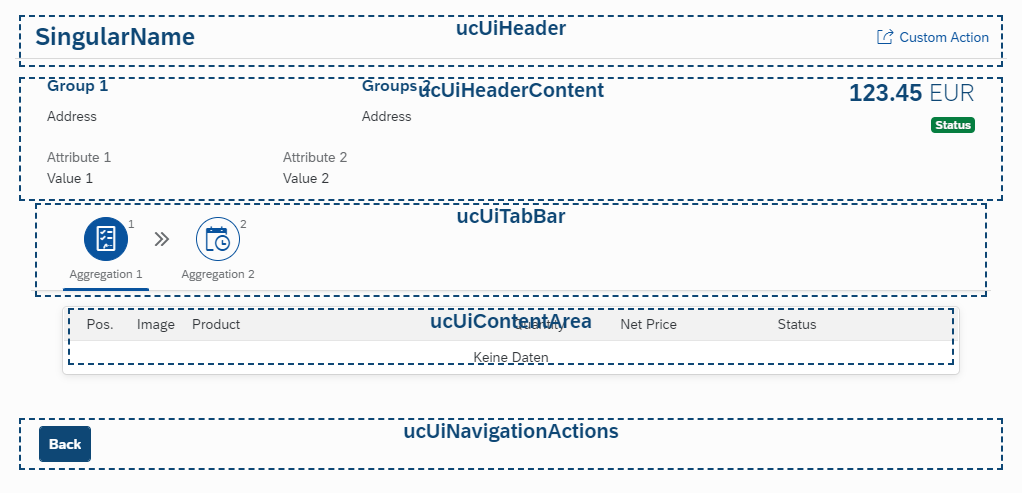
Object Page
The object page floorplan is used to display and categorize all relevant information about an object.
| Component | Description |
|---|---|
| Header | Header bar with title (singular form of entity type) and custom action(s). |
| Header Content | Properties of the entity type. |
| Tab Bar | Tab bar for displaying additional context information (like 1::n aggregations). |
| Content Area | Content of the selected tab bar item. |
| Navigation Actions | Emphasized Back navigation action on the left side. |
Wizard
The wizard floorplan allows users to complete a long or unfamiliar task by dividing it into sections and guiding the user through it. The wizard consists of the walkthrough screen, where the form sections are revealed in sequence after each one is completed, and the optional summary page, where the form is displayed in read-only mode for assessment and final submission.
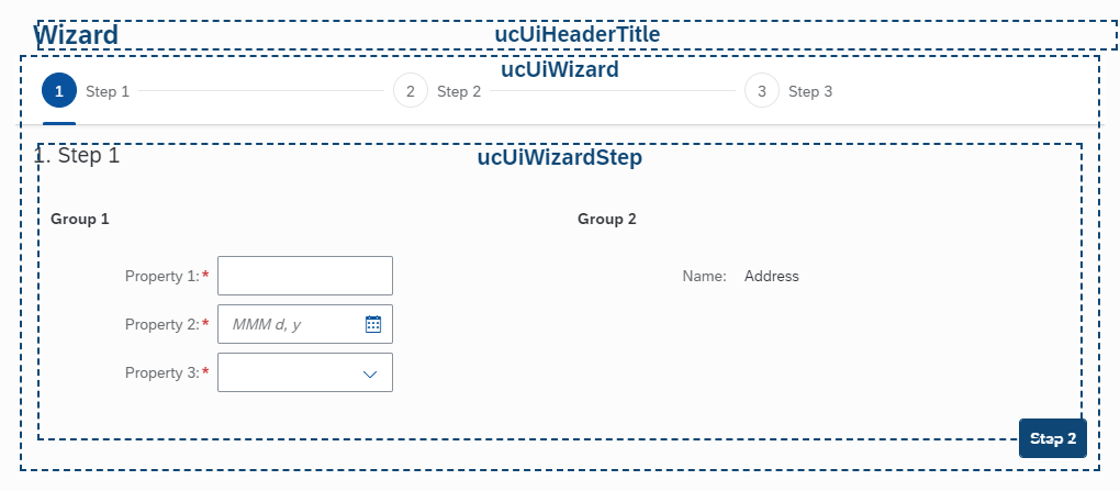
| Component | Description |
|---|---|
| Header Title | The semantically name of the wizard. |
| Progress bar | Actionable (if reachable) select bar of the wizard steps. |
| Step title | Title of the current (selected) step. |
| Next step action | Navigate to next step if available (steps can have validators). |
Illustrated Message Page
The illustrated message page can be used to confirm a former action or event and visualize it with an illustrational image.
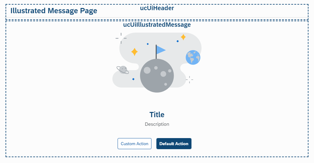
| Component | Description |
|---|---|
| Header | Header bar with a title. |
| Illustrated Message | An illustration visualizing the use case with a title and an optional description. |
| Actions | Optional action(s). Default one should be emphasized. |
Freestyle Page
If none of the above floorplans fit, the freestyle page offers individual layout needs. It just contains the minimal footprint for the page header with title and the contextual footer navigation bar.
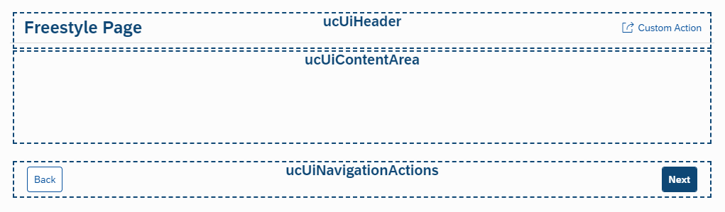
| Component | Description |
|---|---|
| Header | Header bar with title and optional global action(s). |
| Content Area | Freestyle content area using any kind of layout. |
| Navigational Actions | Contains a Back action on the left side and maybe a Process Next action on the right side. The main action type should be Emphasized. |
Browser and Platform Support
| Platform | Device Category | Platform Version | Safari | Web View | Microsoft Edge (Chromium)2 | Google Chrome | Mozilla Firefox |
|---|---|---|---|---|---|---|---|
| Windows1 | Desktop | Windows 8.1 | - | - | Latest version | Latest version | Latest version and latest Extended Support Release (ESR) |
Windows 10 Windows 11 | - | Latest version | |||||
| Touch5, 6 | Windows 10 Windows 11 | - | Latest version | Latest version | Latest version | ||
| macOS | Desktop | Latest 2 versions | Latest 2 versions | - | - | Latest version5 | - |
| iOS & iPadOS3 | Phone and Tablet | Latest 2 versions | Latest 2 versions | Latest version | - | - | - |
| Android4 | Phone and Tablet | Latest 3 versions supported by Google | - | - | - | Latest version | - |
- The specified browsers are also supported in virtual environments, such as Citrix and VMware. Any issues found must be reproducible in a non-virtualized environment.
- SAPUI5 detects Microsoft Edge (Chromium) as Google Chrome and treats it the same.
- We use current Apple iPhone and iPad devices for testing and reproducing the reported issues.
- Android-based devices are very fragmented in matters of operating system variants and hardware diversity. We use current Samsung Galaxy S and Galaxy Tab S series devices for testing and reproducing the reported issues.
Enterprise Features
The individual capabilities of SAPUI5 help you to easily build enterprise apps:
| Added value | Description |
|---|---|
| Consistent UX | SAPUI5 enables the SAP Fiori design evolution towards a consistent user experience across SAP solutions (and beyond). |
| Use anywhere | SAPUI5 allows a single, responsive app implementation for all browsers, platforms, and devices. |
| Hundreds of enterprise UI elements | SAPUI5 offers a rich set of UI elements to build professional user interfaces for an enterprise context while complying to product standards such as security and accessibility. |
| Easy to integrate | SAPUI5 lets you run large numbers of highly-consistent apps that can be integrated to complex business processes of the SAP ecosystem. |
| Powerful extension options | You can extend SAP standard apps and customize UIs without any coding effort thanks to SAPUI5's integrated adaptation capabilities. |
| Flexible tools for any developer | SAPUI5 comes with development environments and tools to efficiently build, test, and deploy apps. Both in pro-code as well as low-code ways. |
| Benefit from innovations | SAPUI5 brings a clear lifecycle separation of application and framework code to centrally innovate while being upgrade-compatible. |
SAP Fiori Elements Convergence
The UDINA Design System mimics as much as possible from the SAP Fiori Design System, but it also has to take care of the One-Page website layout.
The floorplans listed above can be substituted by the ones delivered with SAP Fiori Elements (eg. ListReport and ObjectPage). All other floorplans can be used by design, maybe slightly modified concerning the SAP Fiori Design Guidelines.
With SAP Fiori elements for OData V4, you can use the Flexible Programming Model and add the Freestyle Page Floorplan while leveraging the power of the SAP FE Core. The Building Blocks (aka. Macros) allow you to develop your own annotation driven apps.
Do's and Don'ts
The following sections show additional tips and hints for implementing a fluent user experience.
Controls to avoid
Since the Long-Scrolling website design generally uses only one vertical scrolling container, the usage off controls that create their own vertical scroller should be avoided. Also some controls are very complex and lead to a performance penalty (especially on mobile devices):
| Control | Reason |
|---|---|
| Carousel | The current implementation hides items while scrolling horizontally. A better implementation is the new sap.ui.webc.main.Carousel implementation, that avoids this behavior. |
| Dynamic Page, Page, Semantic Page, Object Page Layout | Creates a fixed height header, scrolling content area and fixed height footer. Also the complex implementation off a DynamicPage slows down the overall performance. In most cases, pages can be substituted by a Panel. |
| Flexible Column Layout | Breaks long scrolling website layout while introducing multiple scroll areas. |
| NavContainer | The main NavContainer is part of the App.view.xml. Only use an additional one, if there really is a special need in conjunction with routing. |
| ScrollContainer | Only useable with vertical="false" setup to avoid vertical scroller. |
| SmartControls | Introduce a huge overhead and performance slow down. They are only relevant for the oDataModel v2 usage. |
| Split App, Split Container, Tool Page Layout | Introduces unnessessary overhead and unwanted website layout. More suiteable for Admin cockpits. |
| Shell Bar | Introduces unnessessary overhead and should be implemented concerning requested needs. |
| Responsive Splitter, Splitter Layout | Destroys classic website design. |
| Grid Table | Breaks with responsive design accross devices. |
| Tile Content | Generally tile content layout should be better replaced by an own card layout. |
Particularities
The following special features must be observed in particular:
| Specialty | Description |
|---|---|
| List based controls | If a list allows growing, than growingScrollToLoad should always set to false. In case of large lists, you would never be able to reach to the end of the Long-scrolling website which leads to a bad and unwanted user experience. |
| Image control | Images support lazyLoading="true", so that images will only be requested will scrolled into viewport. This significantly speeds up the page loading, especially for large lists with huge images. |
| Inline SVG | Since 1.106, there is a new property mode="InlineSvg", that allows to render svg files into the browser DOM to be able to style this svg's with plain css. This offers great styling and theming possibilities using delivered theme vars. When using a custom theme with the UI Theme Designer, this svg images will be able to apply the branding colors. |