Appearance
Design Guidelines
Web design is very similar to fashion design. Each year, something new is trendy and maybe old things are coming back. Blogs like 17 UX/UI Trends for 2021 are showing, what is going on, but not everything fits to our customers.
Concerning our B2B design strategy, we figured out some trends, that will give our solutions and customers an advantage in 2022 (and possibly beyond).
Differentiating UX and UI Design
Since we will mix up UX and UI trends, you can read The Beginner's Guide to UX vs UI to get a better understanding of the related area's.

Additionally, you can read the Justinmind blog, deep dive into A Pilot to the Difference between UI and UX or the Guide to Information Architecture.
Design Trends
Dark Mode
Nearly each OS is supporting a dark mode and this is no more something just for developer nerds, but instead it plays a vital role in user experience.
| Light- and Dark Mode | Advantages of the Dark Mode |
|---|---|
 |
|
Since some advantages turn into negative in a high-light setting, the dark mode should be an additional offering that can be easily switched between dark and light mode (day/night).
Minimalistic Design
Sometimes, Less is more! Today, there is an overload of information, and we will try to focus on the main points. A minimalistic user experience takes care of just the relevant information and focus the user with bold typographie.
Minimalism often goes hand-in-hand with Flat design
Flat design is a style of interface design emphasizing minimalist use of simple elements, typography and flat colors.
Neumorphism
Neumorphism combines flat design and skeuomorphism. It is a visual style that combines background colors, shapes, gradients, and shadows to ensure UI elements’ graphic intensity. All that allows achieving a soft, extruded plastic look and almost 3D styling.
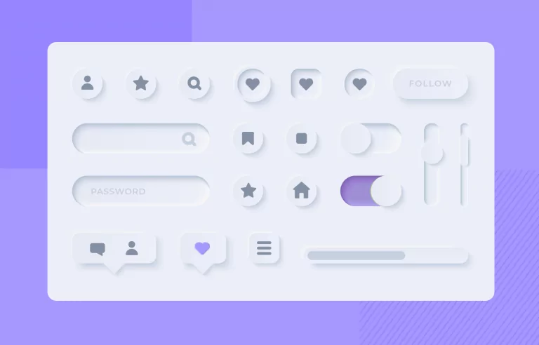
Neumorphism is the contrast of Flat design. It gives users a more organic and intuitive feeling, that a raised button can be pressed while clearly visualizes different control states.
Micro Interactions
Micro interaction exists in every software application. We use it every time while using different applications. The “Like” feature of Instagram and “Retweet” of Twitter are the perfect examples of micro-interaction.
Under the hood of SAPUI5, more and more features as running asynchronly and there is the need to give a nice and stylish animated feedback (besides the good old busy indicator). Especially, if you have some operations, that will take some time to be executed in the on-premise systems.
SAPUI5 also implemented the Animation Modes, so that control developers can take care of the intensity of the animation.
| Mode | Description |
|---|---|
| full | All animations are shown |
| basic | A reduced, more light-weight set of animations |
| minimal | No animations are shown, except animations of fundamental functionality |
| none | Deactivates the animation completely |
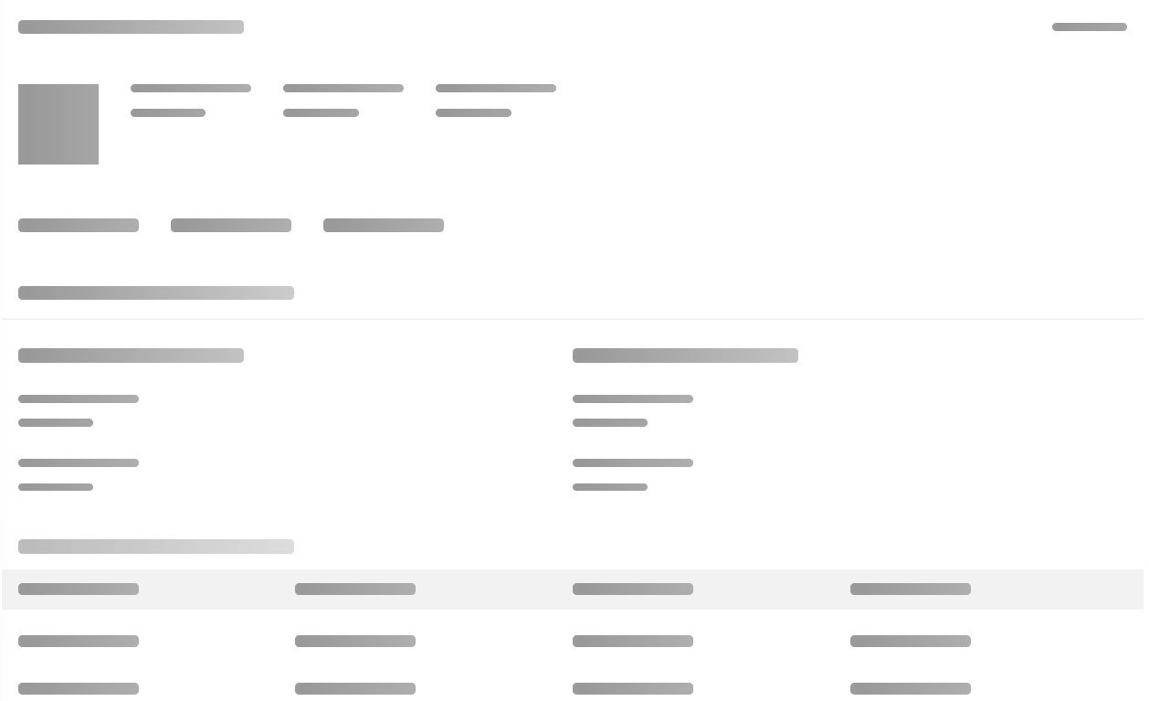
Skeleton Screens
Luke Wroblewski introduced Skeleton Screens in 2013 through his work on the Polar app, later acquired by Google.
A skeleton screen is essentially a blank version of a page into which information is gradually loaded.
Unlike Loading Spinners, where the UI displays all at once. A skeleton screen helps load a user interface gradually, a little at a time. This means that the barebones UI displays first. Then the loaded content is gradually populated on-screen.
The SAP Fiori Placeholder Loading UX pattern joins this approach to create an impression of speed and reliability when an app encounters performance barriers.
Bold Typographie
Did you notice that web typography is getting bigger and bolder? Especially for landing pages and microsites. Bold typography is one of the easiest ways to grab users’ attention.
SAP Horizon introduces Bold design principle
Bold yet friendly, making users feel relaxed and inspired by using bolder colors and typography, with a friendly, approachable, and contemporary look and feel.
Mobile First
Not new, but still important, since more and more users are used to access the internet with their mobile devices.
What is mobile first design?
Mobile-first design is a design philosophy that aims to create better user experiences by beginning the design process with mobile devices in mind first, often prioritizing the smallest of screens.
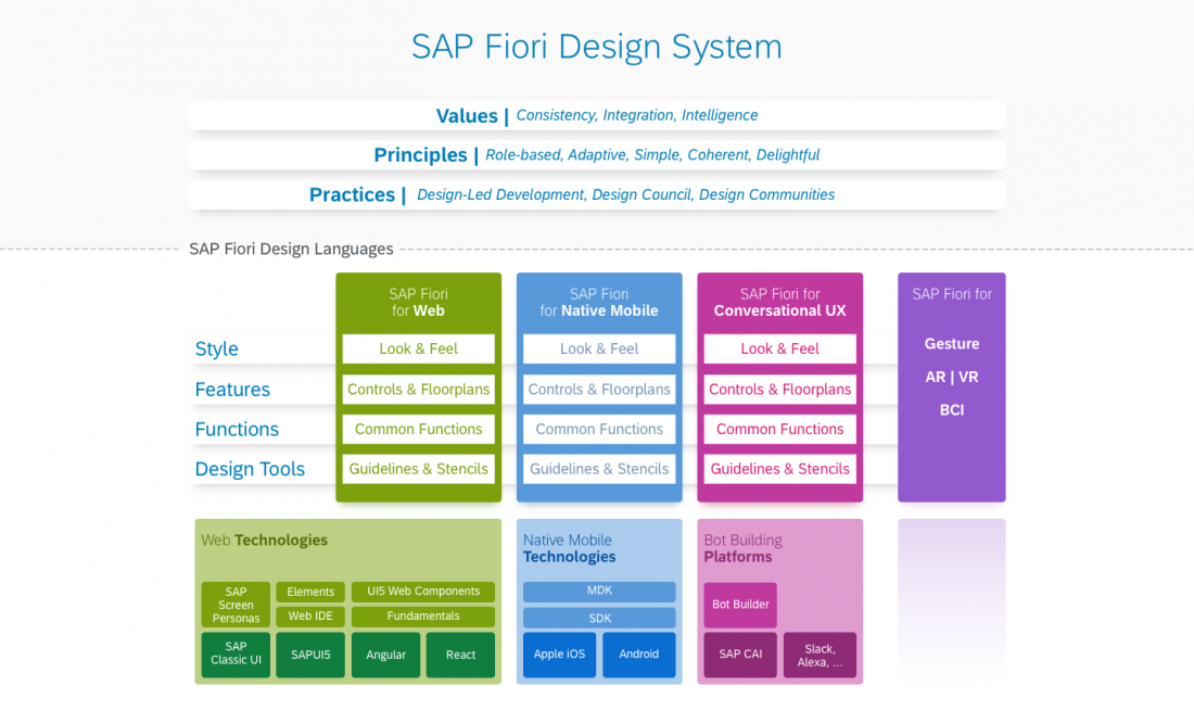
Design System
More and more companies are getting serious about unified design experience and building their design system. Material Design, Ant Design, Fluent Design System are the most popular open-source design system.
SAP is taking care about this with the SAP Fiori Design System.
Neutral Background Colors, Smooth Gradients and Pastel Tones
Microsoft’s fluent design system and the new design approach by Apple in macOS Big Sur are two of the big pushes in gradient-based designs.
This topic should/can be seen as a subtopic of a design system.
Empty and Error State Illustrations
Errors are scary, and emptiness is boring. But they both are an integral part of a software application. SAPUI5 introduced the IllustratedMessage available since 1.88 (currently experimental).
| Usage | Description |
|---|---|
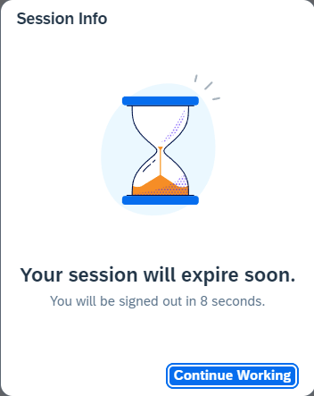 | All applications that require user sign-in should employ a mechanism for automating user sign-out. When the inactivity is about to reach that threshold, a session timeout dialog appears automatically to inform the user. |
Currently, there are many places to replace boring "No Data" text for Lists and Grids by using a more descriptive illustrated message. Today, this needs to be done by the developer, but in the future, hopefully controls will get an nodata aggregation to take care of this.
Frictionless Authentication
Since we are using SAP Customer Data Platform, and we also integrate Microsoft Azure AD B2C, we are able to allow an easy way of authentication across different channels. This is one of the main benefits of the SAP BTP.
Status Quo
Luckily, SAP is also following trends and with the upcoming SAP Fiori Horizon redesign where some trends are also taking into account.
| Trend | Status |
|---|---|
| Dark Mode | The Horizon theme currently does not offer the Dark Mode (like the Fiori theme), but maybe just a matter off time. |
| Minimalistic Design | Horizon is reducing the design to be more minimalistic and flat. |
| Neumorphism | Currently not taken (recognizable) into account. We will play around at least with input controls and the inset look and feel to get rid of the underline placeholder, which look like a formula baseline to mimic paper forms. |
| Micro Interactions | First animations e.g. the animated Switch control are available. |
| Skeleton Screens | The SAP Fiori Placeholder Loading pattern introduces the SAP approach. Besides SAP Fiori Elements see also the Freestyle App Use Case. |
| Bold Typographie | Part of the design principles from Horizon. |
| Mobile First | Available with the early release of the sap.m library. |
| Design System | Taken into account by Horizon, but will be finetuned by developer. |
| Empty and Error State Illustrations | Available in an experimental state inside SAPUI5. Still, controls need additional aggregations to benefit from this. Since SAPUI5 1.101, list based controlls support the IllustratedMessage inside the noData aggregation for visual feedback. |
| Frictionless Authentication | Supported by 3rd Party identity providers like SAP Customer Data Platform or Microsoft Azure AD B2C. |
Conclusion
A lot of the design trends we want to address are currently also taking into account by SAP. At some points, the designers had a different taste, but anyhow they are following the actual best practices in UX and UI design.
This make is easy to benefit from Horizon just by switching the theme (if finally available and supported by SAP).
Anything missing can be done using custom css and custom controls!
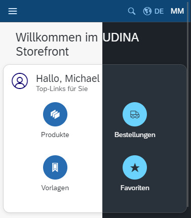
UDINA E-Commerce Enhancements
For our Storefront, which is quite actionable, we have to add things like a Sticky Menu Navigation to enhance the overall user experience and also adding a Scroll-To-Top Button.
These concepts are currently not taken into account by UI5!