Appearance
UDINA Portal
UDINA Portal is an
AppShellthat hosts UDINA Apps, and provides the apps with services such as navigation, embedded support, and notifications.
Depending on the target group, the portal can be used as a service, self-service, corporate, news or web portal.
Based on the UDINA Business Technology Platform, the portal allows seamless integration into a wide variety of systems such as SAP Business Suite or SAP S/4HANA, CRM, On-Premise, etc.
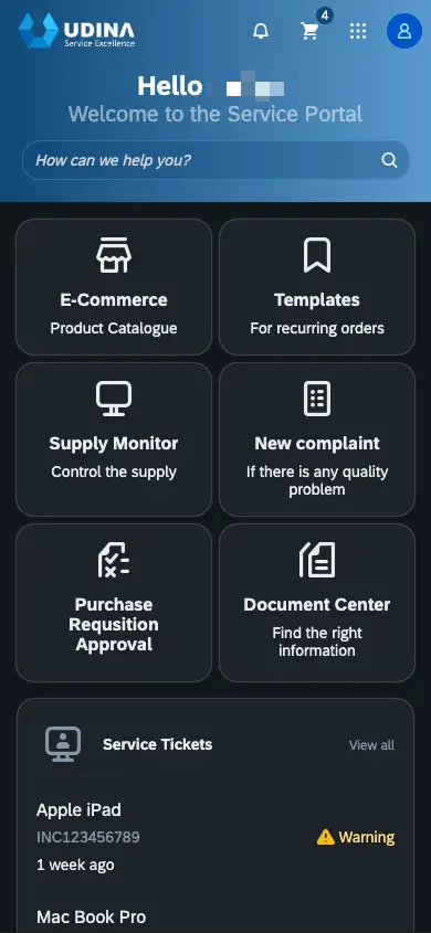
Home Page
The home page is the central access point for UDINA Apps
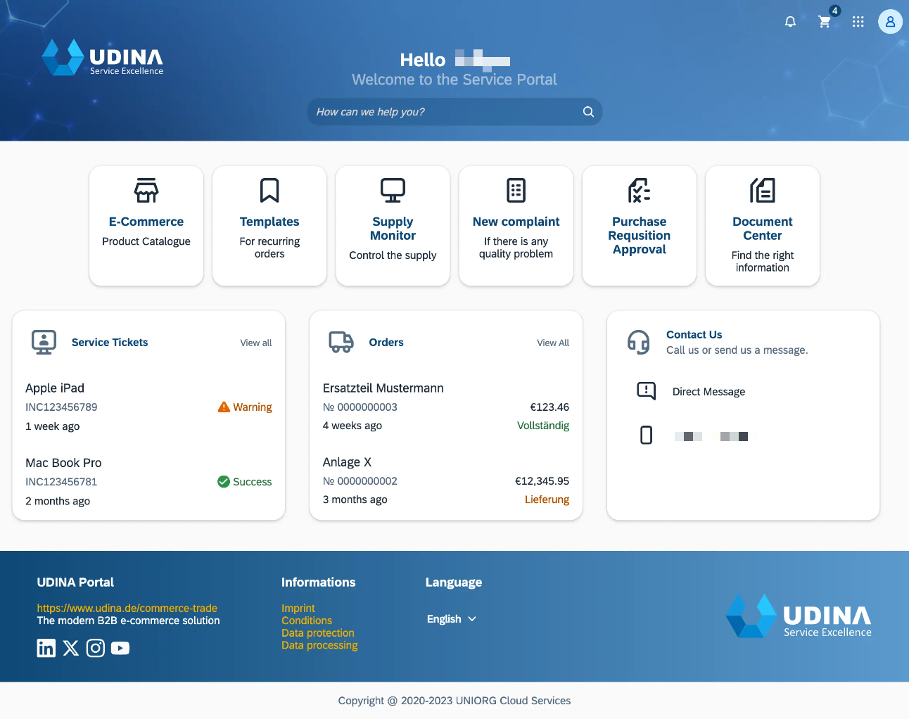
Shell Bar
The portal shell bar remains sticky at the top of the screen with the branding logo. It offers access to cross-application functions, such as the universal search, the user actions menu, notifications and the app switcher with further app navigation options.
- Area for branding purposes
- Universal Search (sticky mode)
- Notifications button
- Optional actions (like shopping cart)
- App Switcher
- User actions menu
Universal Search
The portal offers an universal search function that can be implemented on customer or app need.
Notifications
Users can access notifications by clicking the Notifications button on the right of the shell bar.
The notification list displays system-generated notifications from various sources. Notifications can be prioritized and organized into groups of similar items. From the notification message, users can navigate to the underlying app. Depending on the configuration, notifications can also offer buttons for taking immediate action.
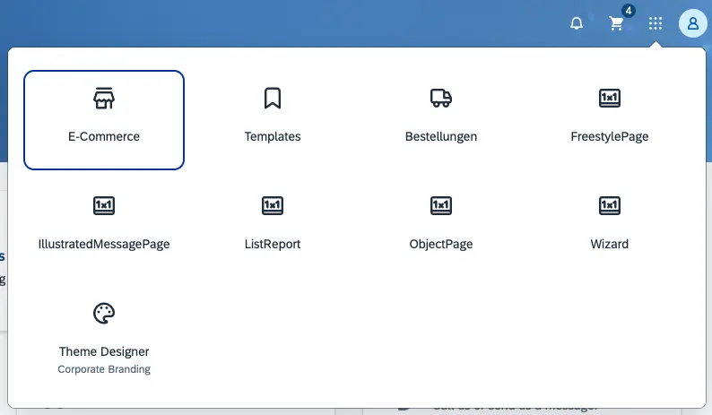
App Switcher
The App Switcher is always available (sticky mode) an allows to quickly switch between apps.
User Actions Menu
The user actions menu offers a range of user-specific services. It is accessed by clicking the icon on the right-hand side of the shell bar. The user actions menu is available in all UDINA screens.
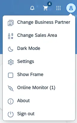
The following options are always available, regardless of the current context:
- A Dark Mode switcher, if a dark theme is allowed by the brand design guide.
- A settings dialog, to personalize the user experience.
- An Online Monitor for web admins to see users, that are currently online and allow further communication like chat and direct messages.
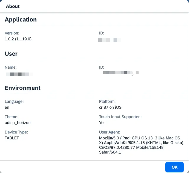
- An About dialog, with details about the SAP Fiori launchpad or app version.
- A Sign Out option for logging off from the portal.
Navigation and Information
The Portal uses Tiles and Integration Cards as an entry point to navigate into the corresponding Business Object.
Integration Cards can also be used to share informational business content as text or diagram.
Role-Based Access
Only Tiles and Cards that are relevant for the user’s role profile are shown, because the portal is role-based.
Tiles
Tiles are used to launch apps and can also show additional application information.
App Switcher Integration
The apps behind the tiles are also available inside the App Switcher, but the Web Administrator can decide, which apps should also be available as a tile on the homepage.
Integration Cards
Integration cards present a new means to expose application content to the end user in a unified way. They share business content in an easy, declarative, and consistent way similar to Microsoft Adaptive Cards.
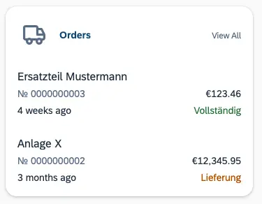
They can show a personalized abstract of data with actions on header and on item level to further navigate to the Business Object overview page or directly drill down into details.
Services
The portal provides a range of central services that can be used by application development teams. For example, the portal handles all navigation between apps, and offers controls for gathering user feedback and contacting the support team.
About
The About dialog displays the following information that are also relevant for support:
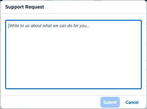
Contact Support
Using the contact form, a user can get in contact with the customer support center. Togther was the request, additional information concerning app info and browser info will be integrated into the service ticket.
Mail
The mail service using mjml allow to send responsive emails. This can be the Contact Supportrequest from a user, but also an Order Confirmation from UDINA Commerce.
SAP Event Mesh Integration
Mails can also be send by transforming a Cloud Event message, send by the SAP Event Mesh.
The portal supports
Sign Out
To sign out of the portal, users choose Sign Out in the user actions menu.
Theming
The portal uses the SAP BTP theming runtime, that allows to render the SAPUI5 controls in the corporate branding of our clients.
It is also possible to offer a light and dark theme to take care of the the users prefered desktop color scheme.
Bring your own design system (BYODS)
In general, the portal uses SAPUI5 Web Technology. However, if a customer offers their own Web Components-based UI technology, it can be integrated into the SAPUI5 technology.
What mean BYODS?
The Stencil-to-UI5 Tooling can be used to automatically create a wrapper library of all web components, that can be used like a regular SAPUI5 library. If a customer has a compelling requirement to carry out SAP integration using its UX Web components, this is possible just by exchanging the skeleton view.
Advantages
- Easily integrate thirdparty Web Components into UI5.
- Two-Way Data Binding works for all models (JSON, OData, etc.).
- Slots will be converted to Aggregations to be declaratively available in XML Views.
- The Flexible Programming Model (FPM) can be used.
Disadvantages
- Dependency on the third party library.
- Additional overhead of loading wrapper and thirdparty components.
Integration Examples
Using Native HTML in XML Views is DEPRECATED
Since SAPUI5 1.120, native HTML is deprecated and will be removed with 2.0. Workaround using custom notepad control
js
sap.ui.define([
	"sap/ui/webc/common/WebComponent",
	"./library"
], function(WebComponent) {
	"use strict";

	return WebComponent.extend("<%= namespace %>", {
		metadata: {
			tag: ...,
			properties: ...,
			defaultAggregation: ...,
			aggregations: ...,
			events: ...,
			methods: ...
		},

		setProperty: function(
            sPropertyName, oValue, bSuppressInvalidate) {
            ...
		},

		updateAggregation: function(
            sName, sChangeReason, oEventInfo) {
            ...
		}
	});
});
xml
<mvc:View xmlns="http://www.w3.org/1999/xhtml"
    xmlns:m="sap.m" xmlns:mvc="sap.ui.core.mvc">
    <namespace-header>
        <namespace-metanav slot="nav">
            <!-- Combine with sap.m controls -->
            <m:HBox>
                <m:Button .../>
            </m:HBox>
        </namespace-metanav>
    </namespace-header>
</mvc:View>
xml
<mvc:View xmlns="namespace.components"
    xmlns:m="sap.m" xmlns:mvc="sap.ui.core.mvc">
    <Header>
        <nav>
            <Metanav>
                <!-- Combine with sap.m controls -->
                <m:HBox>
                    <m:Button .../>
                </m:HBox>
            </Metanav>
        </nav>
    </Header>
</mvc:View>