Appearance
UDINA Connect – Simple. Central. Connected.
Central entry point on the UDINA Business Technology Platform, giving your customers seamless access to all relevant functions through a single, unified portal.
For your customers, this means:
- One central entry point instead of multiple disconnected systems
- Role-based access to the right features at the right time
- Consistent user experience across devices and functions
- Faster access to relevant tools, improving productivity
- Stronger brand identity with a unified look and feel
With UDINA Connect, your B2B customers get a streamlined, professional portal that builds trust, simplifies collaboration, and fosters long-lasting business relationships.
Powered by the UDINA Business Technology Platform, the portal seamlessly integrates with systems like SAP Business Suite, SAP S/4HANA, CRM, and on-premise solutions—ensuring maximum flexibility and connectivity.
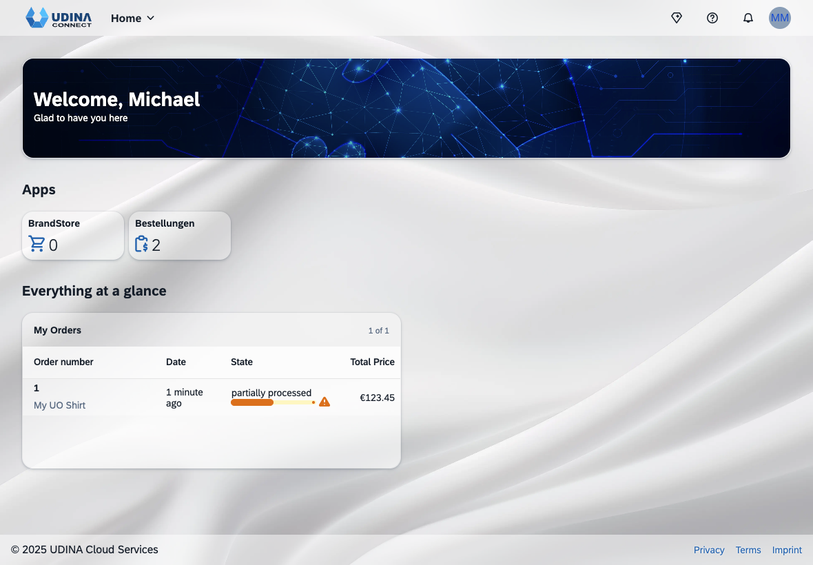
Home
The home page keeps users up to date with the latest information. It provides sections such as News, Apps for launching applications, and Everything at a Glance to quickly overview the most important activities.
Shell
The Home Shell is structured into four main areas: Header, Spaces, Page, and Footer:
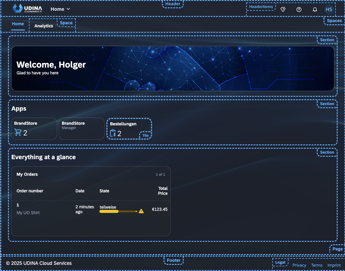
Header
The shell header remains fixed at the top of the screen, showcasing your branding logo and giving users instant access to cross-application functions. It provides seamless navigation through the app switcher, timely updates via notifications, and quick entry to essential user actions.
- Branding area (logo placement)
- All my Apps for seamless navigation
- Header Items
- Optional actions (e.g., AI features, shopping cart)
- Help button for contextual help
- Notifications button for real-time updates
- User actions menu for profile and settings
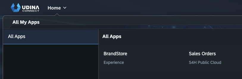
All My Apps
The All My Apps menu is always available in sticky mode, allowing users to quickly switch between applications. Unlike the home page, it displays the full app catalog, not just the apps shown on the start screen.
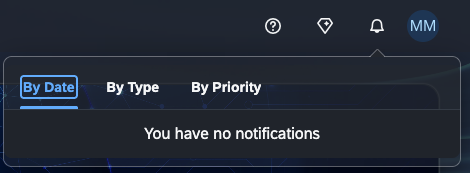
Notifications
Users can open the Notifications panel by clicking the button on the right side of the shell bar.
The notification list shows system-generated messages from different sources, prioritized and grouped for clarity. From each notification, users can jump directly to the related app. Depending on the configuration, actionable buttons may also be available—enabling users to respond instantly without leaving the shell.
User Actions Menu
The user actions menu offers a range of user-specific services. It is accessed by clicking the icon on the right-hand side of the shell bar. The user actions menu is available in all UDINA screens.
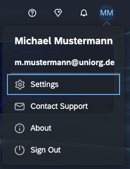
The following options are always accessible, independent of the current context:
- Settings – personalize and adjust the user experience
- Contact Support – Reach out directly for help whenever you encounter an issue
- About – provides details on the SAP Fiori launchpad or app version
- Sign Out – log off securely
Spaces and Pages
A space is a container that holds one or more pages and is assigned to you based on your work profile (user role). In the launchpad, you may have access to multiple spaces, which are shown in the navigation bar. From there, you can easily switch between the different spaces and their pages.
A page is the part of a space that contains apps as tiles and links, organized into sections. It is displayed in the main area of the launchpad and serves as your central starting point. When you log on, you’ll see the apps and sections preconfigured for your role, relevant to your daily work.
Note that pages do not display all apps available to you based on your role and assigned catalogs, but only a selection provided by your administrator. You can access all eligible apps through the search field or the All My Apps menu.
A page can be divided into sections, with each section containing tiles or cards. It is also possible to integrate custom SAPUI5 apps into a card of type component.
Tiles and Cards
Tiles and cards can also be used as entry points to navigate directly to the corresponding business object.
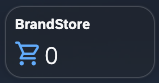
Tiles can have different sizes and may also display additional application information, such as a counter for business objects.
Cards are based on UI Integration Cards and are manifest-driven. They provide a modern way for developers, key users, and end users to create and share business content in an easy, declarative, and consistent manner similar to Microsoft Adaptive Cards. They can display a personalized data overview with actions on the header and item level, enabling navigation to the business object overview page or direct drill-down into details.
| Tile | Card |
|---|---|
 |  |
Role-Based Access
Only the tiles and cards relevant to the user’s role profile are displayed, as the portal is role-based.
Footer
The footer displays copyright information and provides additional links to legal documents such as Privacy, Terms, and Imprint. These links can be maintained and localized using a lightweight CMS.
Services
UDINA Connect offers a range of central services for application development teams. It manages navigation between apps and provides built-in options for collecting user feedback and contacting the support team.
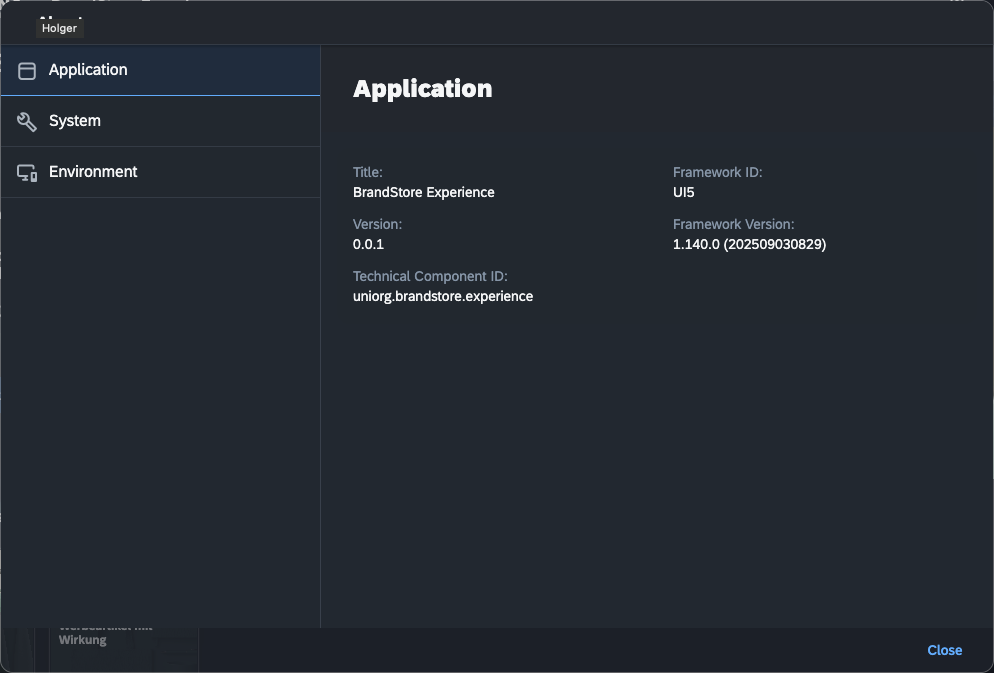
About
The About dialog displays the following information, which is also relevant for support:
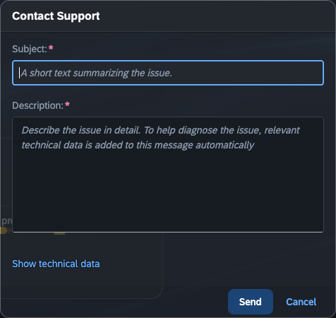
Contact Support
Using the contact form, users can reach the customer support center. Along with the request, additional details such as app information and browser data are automatically included in the service ticket.
Mail
The mail service, based on mjml, enables sending responsive emails. These can include a Contact Support request from a user or an Order Confirmation from UDINA Commerce.
SAP Event Mesh Integration
Mails can also be send by transforming a Cloud Event message, send by the SAP Event Mesh.
Notifications
Notifications keep users informed about important tasks and requests that require their attention. They provide real-time updates on the latest and most relevant events related to the user’s business role.
The shell retrieves notifications from the notification channel, a backend component that aggregates messages from different providers configured in your environment. For certain notification types, users can also choose to receive them on a mobile device or via email.
Sign Out
To sign out of the portal, users select Sign Out from the user actions menu.
Theming
Since the latest UX update, the entire theming can be controlled through CSS variables. This ensures that all widgets and controls fully adapt to the customer’s corporate UI.
Common Data Model
What is the Common Data Model (CDM)
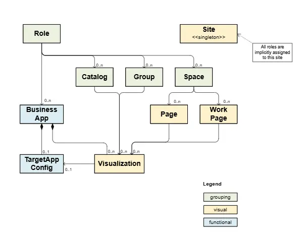
The Common Data Model (CDM) is the basis for interoperability and content federation of business content from various SAP products, all integrated in a unified manner in one site that serves as a central entry point.
The CDM is an evolving model. The latest schema is version 3.2. The version of the schema determines which business content can be included in it. The core business items - roles, catalogs, groups, can be used in any version. Spaces and pages can be used in version 3.1 and up, and the latest added items, workpages ans site, can be used in version 3.2 and up.
To unify data formats, Microsoft, SAP and Adobe have agreed to pursue an Open Data Initiative. Part of this initiative is to develop a Common Data Model (CDM).
The purpose of the CDM is to store information in a unified shape, which consists of data in CSV or Parquet format, along with describing metadata JSON files.
The unified SAPUI5 shell sap.ushell implements a CDM model to offer an unified launchpad for various solutions such as the FLP for HANA or S/4HANA, SAP Build Work Zone or SAP Cloud Portal Service.
SAP Build Work Zone Project Templates for Content Packages
Launchpad Content Sections
The launchpad has the following sections in the CommonDataModel.json file:
| Section | Description |
|---|---|
| Sites | The sites section defines the launchpad site settings. Here you can find settings that affect the launchpad runtime, personalization, and SAPUI5 version. |
| Catalogs | Launchpad catalogs are used to group apps together in the App Finder. In Cloud Foundry the authorization is defined by scopes and not by catalogs, therefore catalogs are used for categorization in the App Finder and are optional. The launchpad contains one catalog by default. |
| Groups | Launchpad groups are used to group tiles together in the home page. The grouping is usually based on common criteria such as a work flow or frequency of use. The launchpad contains one group by default. |
| applications | Applications respresent a Tile in the launchpad supporting different launch operations such SAPUI5, URL, Plugin. |
| systemAliases | System aliases decouple physical addresses of services using the SAP BTP Destination Service. |
| visualizations | Contains the visual representation part of Applications, how tiles are shown on the launchpad. |
| vizTypes | Additional informations for Custom Tiles. |
| pages | New Experience using Pages and Spaces |
| menus | Organizes and map Spaces with Pages. |
Runtime Site
When running an UDINA CDM Portal service site in a browser, you see the following areas:
- The address bar that contains the URL of the launchpad page
- The shell header of the launchpad
- The iFrame in which the apps run
The URL of the site page is composed of the following parts:
- The site URL: https://... ondemand.com/site?<…> (or custom domain)
- The intent, which is composed of the navigation properties of the App:
#<semantic object>-<action>?<intent parameters>
Supported Settings
| Feature | Runtime Setting | Values |
|---|---|---|
| App Finder | enablePersonalization | Boolean |
| Personalization of groups/tile/links | enablePersonalization | Boolean |
| Tile size | sizeBehavior | Responsive / Small |
| Theme Selection | enableSetTheme | Boolean |
| Group Display Mode | enableHideGroups | Boolean |
| Language Selection | enableSetLanguage | Boolean |
| Search in Shell header | enableSearch | Boolean |
| Recent Activity and Frequently Used | enableRecentActivity | Boolean |
| Notifications | enableNotificationsUI | Boolean |
Unified Shell Services
All services are singleton objects identified by their (resulting) name. To retrieve a valid instance of this service, it is necessary to call:
ts
sap.ushell.Container.getServiceAsync("Name") // returns Promise| Name | Description |
|---|---|
| NotificationsV2 | Fetching user notification data from the Notification center and exposing them to the Unified Shell and Fiori applications UI controls. Notifications are fetched on WebSocket "ping" and/or periodic polling mechanism. |
| SupportTicket | Creates a Support Ticket. Forwards the given data (JSON object) to the associated adapter with additional client context informations. |
| UserInfo | Allows retrieving information about the logged-in user: ID, first name, last name, full name, e-mail address. |
Bring your own design system (BYODS)
In general, the portal uses SAPUI5 Web Technology. However, if a customer offers their own Web Components-based UI technology, it can be integrated into the SAPUI5 technology.
What mean BYODS?
The Stencil-to-UI5 Tooling can be used to automatically create a wrapper library of all web components, that can be used like a regular SAPUI5 library. If a customer has a compelling requirement to carry out SAP integration using its UX Web components, this is possible just by exchanging the skeleton view.
Advantages
- Easily integrate thirdparty Web Components into UI5.
- Two-Way Data Binding works for all models (JSON, OData, etc.).
- Slots will be converted to Aggregations to be declaratively available in XML Views.
- The Flexible Programming Model (FPM) can be used.
Disadvantages
- Dependency on the third party library.
- Additional overhead of loading wrapper and thirdparty components.
Integration Examples
Using Native HTML in XML Views is DEPRECATED
Since SAPUI5 1.120, native HTML is deprecated and will be removed with 2.0. Workaround using custom notepad control
js
sap.ui.define([
	"sap/ui/webc/common/WebComponent",
	"./library"
], function(WebComponent) {
	"use strict";

	return WebComponent.extend("<%= namespace %>", {
		metadata: {
			tag: ...,
			properties: ...,
			defaultAggregation: ...,
			aggregations: ...,
			events: ...,
			methods: ...
		},

		setProperty: function(
            sPropertyName, oValue, bSuppressInvalidate) {
            ...
		},

		updateAggregation: function(
            sName, sChangeReason, oEventInfo) {
            ...
		}
	});
});
xml
<mvc:View xmlns="http://www.w3.org/1999/xhtml"
    xmlns:m="sap.m" xmlns:mvc="sap.ui.core.mvc">
    <namespace-header>
        <namespace-metanav slot="nav">
            <!-- Combine with sap.m controls -->
            <m:HBox>
                <m:Button .../>
            </m:HBox>
        </namespace-metanav>
    </namespace-header>
</mvc:View>
xml
<mvc:View xmlns="namespace.components"
    xmlns:m="sap.m" xmlns:mvc="sap.ui.core.mvc">
    <Header>
        <nav>
            <Metanav>
                <!-- Combine with sap.m controls -->
                <m:HBox>
                    <m:Button .../>
                </m:HBox>
            </Metanav>
        </nav>
    </Header>
</mvc:View>